Paul van der Zee
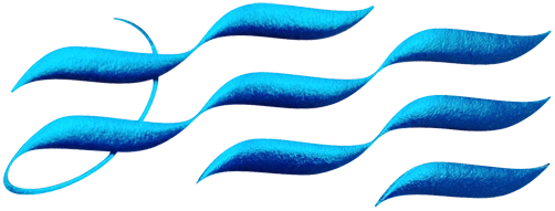
Arps did an amazing job on printing my stationary! We chose to use exclusive greyish paper, imported from Germany (Lakepaper, eisblau). The logo is printed with foil stamping and embossing. No print on the envelopes, only the embossing. Very subtle esthetics! I added some photos to show you what I'm so thrilled about, but I think you should really see – and also – feel this in person. So don't hesitate to ask me when you see me, I'd love to hand over one piece of (graphic) art. Here's a little bit of philosophy about the logo: The wavy shapes are coming out of calligraphic hand movements. The curl on the left stands for the fine, detailed style you can find in my work and it completes the logo into the part of my last name 'ZEE' (Sea, dutch). The foil stamp is the ultimate finishing. The blue color changes under the angle you look at it, like standing on the beach watching the waves rolling towards you, separate but together, bringing you new stories from the sea time after time. What a nice view!
